Get an estimate in 60 seconds. No email required.
An app explainer video has a few seconds to show why someone should download, open or pay for an app. These 18 app explainer video examples come from real mobile and web apps in fintech, HR, travel, productivity and AI.
| What are the best app explainer video examples? Strong app explainer video examples include CryptoSea for a trading tool, Hibob for a mobile HR app, Shopboxo for store setup, Payright for payment plans, FreshBooks for mobile accounting, Pleo for expense capture, Cryptohopper for a trading bot, Momatu for family photo sharing, Perplexity for a voice feature, Beam for a mobile wallet, Bear 2 for an app update, Microsoft for the Office app, Square for small business payments, Traveloka for travel booking, Lloyds Bank for mobile banking, Now Health International for a health insurance app, Embark for public transport and Gigtown for music booking. |
An app explainer video is a short video that shows what an app does, who it is for and how it works. Most run 30 to 90 seconds. They usually combine animated interface moments with a simple story about the problem the app solves.
App explainers appear on app store listings, landing pages, paid social and onboarding screens. Many are closer to a short product demo video, while others lead with the brand story and show the interface only briefly.
This article looks at 18 app explainer videos, from fintech and HR apps to travel, productivity and AI tools. For each one, I describe what the video shows and what other app teams can take from it. After the examples, I cover what an app explainer video costs and how to plan one.
Here is a quick overview of the 18 videos in this article. The table links to each example below.
Every entry had to pass four checks. The video explains a mobile or web app. The message is clear: it states what the app does, who it is for and why it matters, without burying that under a feature list. The video is still live and embeddable today. And together the list covers different jobs, from launch videos and feature updates to how-to walkthroughs.
No company here has published performance data for its video, so each entry says so rather than guessing. Every entry was last verified in September 2026.
The lead example, CryptoSea, comes from the Creamy Animation video library. The other videos were published by the app companies or by the studios that made them.
| # | Company | Use |
|---|---|---|
| 1 | CryptoSea | App marketing explainer for a crypto trading tool |
| 2 | Hibob | App explainer for remote and distributed teams |
| 3 | Shopboxo | App explainer that demonstrates speed |
| 4 | Payright | Fast-paced app explainer built for social |
| 5 | FreshBooks | UI-first app explainer |
| 6 | Pleo | On-brand app explainer animated at 6 fps |
| 7 | Cryptohopper | Hybrid sales app video |
| 8 | Momatu | Emotional hybrid brand video for an app |
| 9 | Perplexity | Short feature explainer for an AI app |
| 10 | Beam | App explainer for a multi-country audience |
| 11 | Bear 2 | Launch explainer for a major app update |
| 12 | Microsoft | App explainer for a combined product |
| 13 | Square | How-it-works app explainer for small business |
| 14 | Traveloka | Store listing explainer for a travel app |
| 15 | Lloyds Bank | App update explainer for existing customers |
| 16 | Now Health International | Step-by-step app explainer |
| 17 | Embark | 40-second app explainer |
| 18 | Gigtown | Character explainer for a two-sided app |
Runtime: 1:00
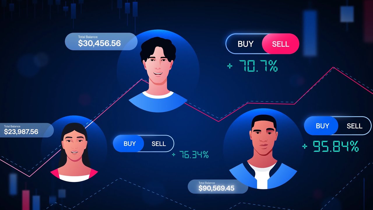
CryptoSea makes trading indicators and other tools for people who invest in crypto. The app explainer runs one minute, which suits a fast-moving audience.
Performance data: none published.
Why it works:
Takeaway:
For fast-moving audiences, cut every second that does not explain the app.
The CryptoSea video is drawn from the video library of Creamy Animation.
case study
See How We Make App Tutorial Videos and Why They Work
Brief, script, storyboards and final frames
See The Case StudyRuntime: 1:28
Hibob’s mobile app brings its HR platform to remote and distributed teams. Employees can follow company updates, manage timesheets and connect with coworkers in one place.
Performance data: none published.
Why it works:
Takeaway:
Show the small daily tasks your app makes easier.
Runtime: 1:00
Shopboxo helps entrepreneurs and sellers set up a mobile website in 30 seconds inside an intuitive app. The animation shows the setup process with smooth, dynamic visuals rather than static screenshots.
Performance data: none published.
Why it works:
Takeaway:
If speed is your promise, show the whole task inside the video.
Runtime: 0:41
Payright is an Australian payment plan provider. The explainer uses an upbeat, fast-paced style designed for social media.
Performance data: none published.
Why it works:
Takeaway:
Design for the channel first. Social needs speed.
Runtime: 0:27
FreshBooks offers accounting tools for self-employed professionals and their teams. This short piece is part of a series that uses simplified product screens to show the app’s user-friendly design.
Performance data: none published.
Why it works:
Takeaway:
Simplify your interface on screen. Viewers need the idea, not every button.
Runtime: 0:37
Pleo is a business spending app. This is part of a series of app videos. It was animated at 6 frames per second to match Pleo’s distinct brand style.
Performance data: none published.
Why it works:
Takeaway:
Your brand can live in how things move, not only in colors and logos.
Runtime: 1:15
Cryptohopper offers automated crypto trading. This hybrid sales app video combines illustration and animation to present the app.
Performance data: none published.
Why it works:
Takeaway:
An app video can sell and explain at the same time.
Runtime: 1:25
Momatu is an all-in-one app for families to privately share and store photos and videos. The hybrid brand video uses storytelling to build an emotional connection with viewers.
Performance data: none published.
Why it works:
Takeaway:
Consumer apps sell a feeling. Lead with it.
Runtime: 0:36
Perplexity introduces voice to voice on iOS. Users ask any question out loud and hear the answer.
Performance data: none published.
Why it works:
Takeaway:
Feature launches work best as short, single-idea videos.
Runtime: 1:11
Beam describes itself as the leading mobile wallet app in the UAE, used by more than 750,000 people. The video presents the app to customers in several countries.
Performance data: none published.
Why it works:
Takeaway:
If your app serves several markets, lean on visuals that need little translation.
Runtime: 1:21
Bear is a writing and notes app. This video launches Bear 2, which added over 20 new features including tables, nested styles, pinned tags and backlinks.
Performance data: none published.
Why it works:
Takeaway:
Group a long feature list under one theme your users care about.
Runtime: 1:13
The Office mobile app combines Word, Excel and PowerPoint in one app for getting work done on a phone. The video introduces it for Android and iOS.
Performance data: none published.
Why it works:
Takeaway:
When your update simplifies things, make the simplification the headline.
Runtime: 2:25
Square explains that it is more than a card reader. The video shows how it helps businesses start, run and grow with affordable tools.
Performance data: none published.
Why it works:
Takeaway:
If buyers see only one part of your product, use the video to widen the view.
Runtime: 1:39
This introduction video for the Traveloka app was made for its Google Play listing. It was planned for release in several regional languages.
Performance data: none published.
Why it works:
Takeaway:
Your app store listing deserves its own explainer.
Runtime: 2:26
Lloyds Bank updated its mobile banking app for iPhone and Android. The video shows the new features and how customers can manage money on the move.
Performance data: none published.
Why it works:
Takeaway:
App explainers are for adoption too, not only acquisition.
Runtime: 1:11
Now Health International is a global private medical insurance provider. The video explains how to use its app step by step.
Performance data: none published.
Why it works:
Takeaway:
A simple how-to can reduce support questions after launch.
Runtime: 0:40
Embark is a public transport app covering more than 500 cities and towns. It shows costs and carbon emissions for every route and integrates with Uber.
Performance data: none published.
Why it works:
Takeaway:
Specific numbers make a short app video feel substantial.
Runtime: 1:41
Gigtown makes booking music talent for events easier. The video explains the app for both sides: the people booking and the musicians.
Performance data: none published.
Why it works:
Takeaway:
For two-sided apps, show both users getting what they want.
Price depends on runtime, visual treatment and production scope. Most projects fall into one of three tiers.
| Tier | Typical range | Best for |
|---|---|---|
| AI-Assisted | $2,500 to $4,000 | A short app intro or single feature |
| Standard | $3,000 to $10,000 | A custom explainer with UI animation, voiceover and sound design |
| Premium | $10,000 to $25,000 | Character animation, 3D device shots or a multi-video series |
Most app projects take 3 to 6 weeks from creative brief to final delivery. For a full breakdown by style and length, see the explainer video cost guide.
Decide what the viewer should do next. That could be a download, a sign-up or trying one feature. Payright and Perplexity each focus on a single idea and finish in under 45 seconds.
Decide where the video will run before you write the script. Traveloka made its video for a Google Play listing. Payright built its video for social feeds.
Use real app screens, but strip out the clutter. FreshBooks uses simplified product screens so the idea reads at a glance.
Open on a job the viewer already does. Hibob starts with timesheets and company updates. Shopboxo shows the whole store setup inside the video.
List the store, social and in-app versions you need before production starts. One master video can then be cut into shorter versions for each placement.
It depends on the app. Gigtown uses characters to show both sides of a booking app. Most of the other examples lead with the interface instead.
Yes. Lloyds Bank and Now Health International use their videos to help current customers use new features and complete tasks in the app.
The app explainer videos on this list take different routes. Some lead with emotion. Some show one feature. Some walk through the whole app. What they share is a clear promise and a short runtime.
The strongest ones show the app doing a real task, so the viewer can picture using it before they download.
Larry is the founder and Chief Storyteller at Creamy Animation, founded in 2009. He leads a team that creates story-driven videos for businesses and nonprofits. 15+ years in video strategy and production, specializing in SaaS, B2B, and nonprofit storytelling. A marketer, designer, and animator, Larry has overseen the production of more than 1,500 videos for Fujitsu, Logitech, Warner Brothers, NFL, Blockdaemon, Astronomer, Canonical, and 370+ others.
For Larry, God is first, and everything else is a blessing that comes from serving Him. When he’s not working, he’s hanging out with his wife and three kids, playing the piano, or pursuing his filmmaking side hustle.Â